

A huge amount of information is produced daily in the modern world. When dealing with data, it could be challenging to fully comprehend your data if it is just presented in tabular form. Examining the data for certain trends or patterns may be challenging if it is in raw format. To ensure that readers completely understand the meaning of the data, we must visualize or otherwise portray it. Choose the finest models and clean them correctly for that. By offering a clear, well-organized pictorial representation of the data, data visualization makes it easier to understand, observe, and analyze the data. This makes trends and correlations more obvious that cannot be seen in data presented as a table or CSV file.
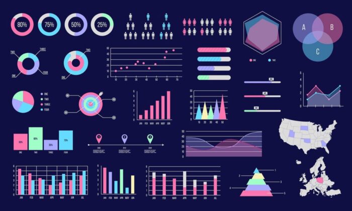
We can use various Python data visualization libraries, like Matplotlib, Seaborn, Plotly, etc., to visualize the data. We will go over how to use some Python data visualization modules and go into great detail about the following subjects in this post, The Comprehensive Reference to Data Visualization with Python.
What is Data Visualization?

The study of how to visually represent data is known as data visualization. It effectively communicates findings from data by graphically plotting them.
Through data visualization, we can gain a straightforward depiction of our data. When data is presented in pictures, maps, and graphs, the human mind analyses and understands it more quickly. Data visualization is advantageous for both small and large data sets. It excels in large data sets because it is challenging to view manually.
Python has many charting libraries, including Matplotlib, Seaborn, and many additional free data visualization tools with various features for building unique educational and visually appealing charts to show data most simply and powerfully. Check out these free data visualisation courses and master yourself in data visualization.
Matplotlib and Seaborn
Python data visualization used for data visualization includes Matplotlib and Seaborn. They have pre-built modules for producing several types of graphs. The user-friendly, low-level data visualization with Python toolkit Matplotlib is built on NumPy arrays. While Seaborn is generally used for statistical graphs, Matplotlib is used to integrate graphs into programs.
There are many different plots in Matplotlib, including scatter plots, line plots, histograms, etc. A lot of freedom is provided by Matplotlib compared to Seaborn.
A high-level interface called Seaborn was constructed on top of Matplotlib. It offers stunning design themes and color schemes to create more appealing graphs.
Let’s do a comparative study to comprehend this better. The two well-known visualization libraries for Python, Matplotlib, and Seaborn, are compared in the table below.
Seaborn |
Matplotlib |
| It can carry out complex visualizations with fewer commands and is primarily used for statistics visualization. | It plots simple graphs like line charts, bar graphs, etc. |
| It is compatible with whole datasets. | Compatible with Datasets and arrays. |
| With data arrays and frames, Matplotlib functions effectively. The figures and aces are seen as objects. | Seaborn treats the entire dataset as a single entity and is noticeably more organized and functional than Matplotlib. |
| For exploratory data analysis, Matplotlib is more flexible and works well with Pandas and Numpy. | Seaborn is primarily used for data analysis and includes many built-in themes. |
Pandas Visualization
Pandas is a free, open-source, high-performance library that offers data structures like data frames and data analysis techniques like the ones we’ll use in this post for visualization. Plotting a pandas dataset and series is quite simple with Pandas Visualization. Additionally, it provides a higher-level API, unlike Matplotlib, requiring less code to achieve the same outputs. Conda or Pip can be used to install Pandas.
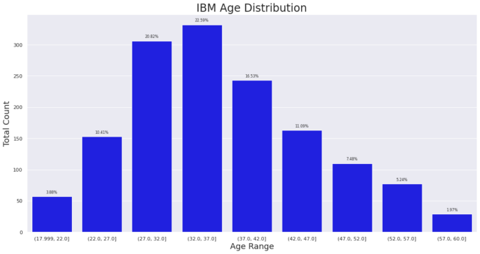
Bar Plot in Matplotlib
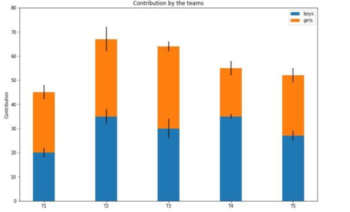
A bar graph can be displayed if the data is categorical. A bar plot, often known as a bar chart, is a graph that uses rectangular bars of lengths and heights proportionate to the values they represent to depict a category of data. A bar graph uses bars to indicate quantity on the y-axis and classification on the x-axis to plot data. Bar graphs display data that falls into a particular category using bars of variable heights. Both horizontal and vertical graphs of the bars are possible. Each plot’s axes display the same divisions under comparison, whereas the other axis displays the measured values related to those categories. This allows for comparisons between the two different categories.
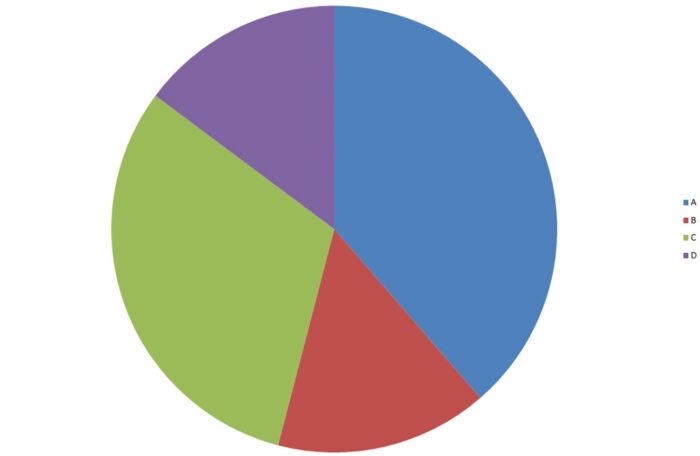
Plot a Pie Chart using Matplotlib
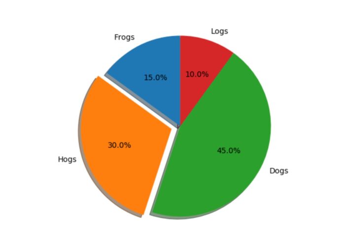
A circular statistical graphic called a pie chart can only show one series of data at a time.
The chart’s area represents the overall percentage of the provided data. The area of the pie slices represents the proportion of the data pieces. Pie wedges are individual pieces. The wedge’s area is based on the length of the arc. The area of wedges corresponds to the portion’s proportion of the entire data set. Pie charts are frequently used in corporate presentations since they offer a quick summary of information like survey results, resources, sales, operations, etc.
Changing Pie Charts
A pie chart could be modified based on several factors. The start angle attribute spins the plot by the provided number of degrees in the opposite direction of the pie chart’s x-axis. If the boolean value for the shadow attribute is true, a shadow will be visible beneath the pie’s rim. Pie wedges can be altered using the wedge prop function, which accepts a Python dictionary as an argument and name-value pairs indicating the wedge’s linewidth, edge color, etc. The pie plot module’s method pie () allows pie charts to be created. By default, a pie chart’s wedges or pies are arranged counterclockwise by the pie () function of PyPlot.
The percentages are presented on the wedges according to autopct’s control.
Conclusion
By putting data in a graphical context and attempting to comprehend it, data visualization with Python seeks to reveal patterns, trends, and connections that may not otherwise be visible. Python data visualization provides several other packages that can produce various visualizations, graphs, and plots. This article examined Seaborn, Pandas visualization, Bar Charts, Pie Charts, and Matplotlib.
Therefore, it’s crucial to comprehend the benefits and drawbacks of the various libraries as well as how to make the best use of them. For more detailed information, click here.


